Finalizing of Magazine Cover – Genesis

I felt that the placement of the film title “Brink” and our main actors name “Patrick Manginsay” appeared out of place on the magazine cover. I stated previously that I had placed this featured article title on the left third in order for our audiences to notice it first and this happens to be the issue. It appears that the placement of the title takes too much from the main image of the magazine cover and I have therefore addressed this issue with a couple of variations. Below are the variations of different main article placements, I also changed the typography of the actor’s name in order to have some lower case lettering on the front page:

By placing the title on the bottom right, it is intended that the audience will see this last, not only will they know what the film title is, but it is likely that they will take a reading on the main image before even seeing the main article. Since the main image is a very strong image that hints drivers in our plot, we want this to be the main focus of the cover, without the titles taking too much away from it. Some variations may feature the title centered and helps with the symmetry of the page and compliment the minimal style of the page as a whole.

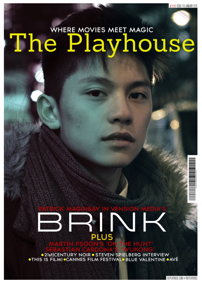
Final Magazine

Final magazineThis is my Final magazine design after making the necessary changes to make draft. As you can see I have included sell lines as a means of increasing the conventions often seen within magazines to insure it was confused with a poster. Despite the inclusion of these sell lines I believe the magazine still has a minimalist approach after using layout to my advantage. Overall I am very pleased with this product and I believe it can easily be identified as a part of the promotional package for ‘Brink’.


Magazine Draft

magazine draftIn response to Yvonne’s Magazine I decided to make my own independent film magazine featuring our protagonist Tyler. Looking at existing magazines such as ‘Little white lies’ and ‘Sight&Sound’ I saw how effective their minimalist approach was. This is the reason for the layout of my magazine using very little space to house the majority of the text forcing the viewer to pay attention to the cover image. However by paying close re-looking at ‘Little white lies’ I noticed they often changed their front cover image graphically, this however was not something I wanted to do.


Small update on Magazine Cover by Genesis

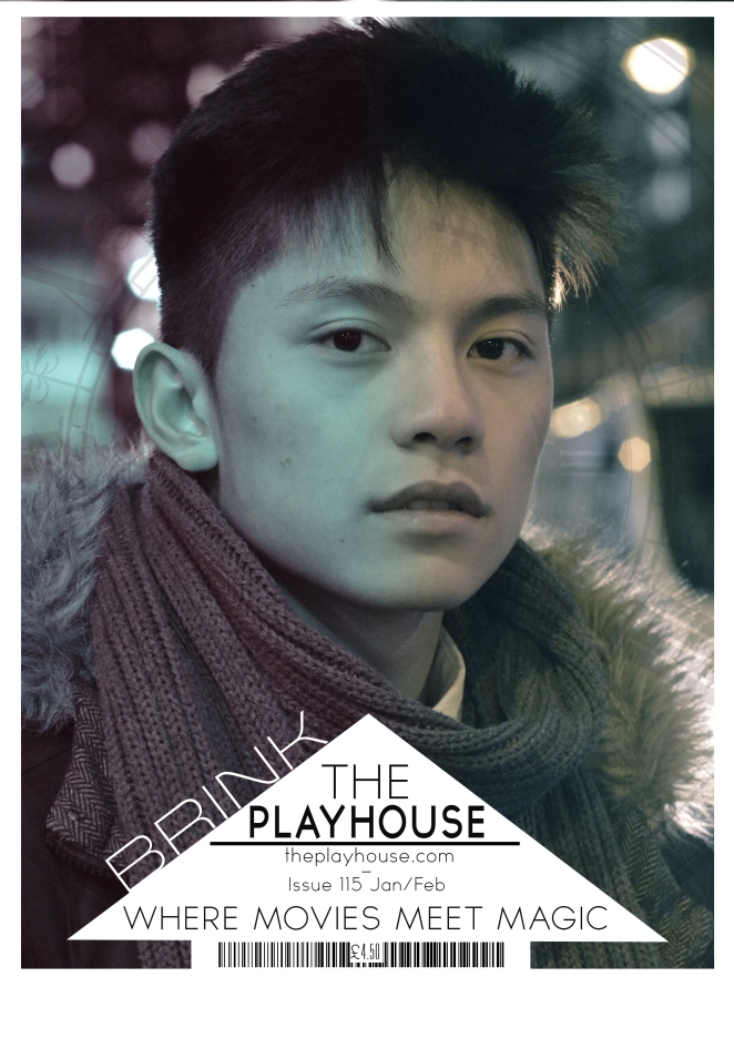
I have made a very small change to my version of our film magazine. The two changes are compared below and highlighted within red circles. I simply changed the typography of the masthead, removing the word ‘Magazine’ as our audience thought this wasnt working well with the layout of the triangle. Instead we kept this simple and went with ‘The Playhouse’ instead. I can agree that this looks much cleaner than before. As of other changes within the masthead triangle, I made some of the text such as the issue number/date and the website have a lowercase in the text. I also applied this to Patrick’s name in his name caption below Brink. The final magazine cover can be seen at the bottom of this page.Updatedmagazineannotation

MagazineUpdated

Alternative Magazine and Contruction Video by Genesis

Taking a look at independent magazines such as Little White Lies, I was inspired to create one based on the style they use. The magazine very often has a digitally edited or illustrated version of starring actors. The pages are very minimal in a sense that hardly any sell lines or feature articles are seen on the front page. Other than a couple exceptions,independent magazines are very minimalistic and the the approach I took with my version of our magazine.

I arranged the masthead so that almost all the typical iconography of a magazine e.g magazine name, barcode, price, issue number, website and slogan, can fit into the triangle. With this, less is drawn away from the digital edit of our main actor Patrick.

I have included 2 versions of the magazine, one black and white and the other with split colours to represent the two choices that our main character has in our film.

Just a short video showing what made up the image for my version of the independent film magazine.

Magazine Designs Updated

FINAL MAG no rip allFINAL MAG no rip bigFINAL MAG no rip small


*Feedback from Genesis:

I like the minimal look of the magazine, especially without the border around the masthead. It looks very clean and gets the point across to the niche audience that our independent magazine appeals to. Rather than the typical bold and dominant featured article that appears on mainstream magazine, this cover repeats the title of the film in the background, which take very little away from the silhouette of our main actor/character. The outline of our character works well especially it being an independent magazine, as it is likely that the actor would be recognizable, given they have seen the film posters for Brink around public or on the internet. Referring back to magazines such as Little White Lies shows that the front cover of a magazine can be as effective without sell lines and since it appeals to a smaller group of people, who have different tastes to those who prefer mainstream, the minimalism of the page will likely attract the niche audience.

FINAL MAG 2FINAL MAG 1FINAL MAG 3

Photos from Teaser shoot

Here are a couple of photos we took with the actor and the props we used for our teaser trailer. Although there were shots we just took on set and wasnt planned, we could potentially use them for alternate posters, website assets or even a magazine cover. The props featured in the photos will have the most significance throughout our trailer and therefore making it suitable to be used for a poster/ website image.

Magazine Ideas – Gun Art

Slide1

It is very common for the gun to be used as mise-en-scene to indicate that the movie being promoted is of the action thriller genre. As can be seen on my sketches I plan to place a gun on the front cover of my magazine to indicate what type of movie is being promoted.

A lot of the images that I have chosen are sketches. That is because i’m following the independent magazine style of ‘Little White Lies’ more which takes more of an artistic liscence as opposed to aiming for realism.

Magazine Idea – Sketch

* the red lines in the background are the movie title repeated

I liked the idea of having the title repeated in the back in a smaller font but was still undecided on the main images I wanted on the magazine.

1. the first image mimics a shot in the trailer when the small child holds a gun up to the camera.

2. the second poster shows images of holes left by gunshots, giving the illusion the magazine itself was shot.

3. the third cover follows more in the style of “Little White Lies” by having a headshot of the main character. His face is partially hidden which implies that he has a secret to hide much like his secret past in the narrative of the story.

4. the third is pretty self explanatory and has similar connotations to the first cover

Magazine Ideas- Name

When in search for a name for the magazine I looked at the synonyms for film

Screen Shot 2015-01-02 at 17.49.39


My favourite 3 words where:

  • Nabes
  1. a neighbourhood movie theatre.
  • Cine
  1. a film; motion picture.
  2. a motion-picture theatre.
  • Playhouse
  1. a theatre where live dramatic performances are given


The name ideas I had were:

  1. The CineNabes Playhouse
  2. The Playhouse
  3. The Cine
  4. The Nabes
  5. The Playhouse Magazine

The theatre is a platform for people to resent their art. As this is also the job of a magazine I thought “The Playhouse Magazine” would be the best name for it.